(Andersen Windows) Have you noticed anything interesting about window frames lately? Chances are, you’re seeing a lot more than the usual white, cream and brown. Colorful frames can offer a pleasing contrast to our walls, creating a refreshing statement both inside and out. Pat Verlodt, a color designer and longtime consultant for Andersen Windows and Doors, spins the color wheel to inspire and inform your next window update.

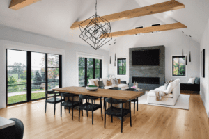
Bold Black

Clean Green
In general, green works well with farmhouse and coastal-style homes as well as traditional or historical houses, which don’t typically call for contemporary colors. On this Craftsman home, custom green aluminum-clad windows pop against smoky blue siding and white casings and trim. The hue is fresh and bright, Verlodt says.
Be sure to consider your house’s other hues when selecting exterior window frames, she adds. Think about your roof color, the permanency of brick or stone and whether you’re committed to your siding. While all exterior windows should be a consistent color, you can mix it up inside. Coordinate your frames with cabinets, baseboards or other trim to create visual harmony. The interior sashes of the cased bay window seen here, for instance, are white.

Easygoing Gray

Bright Blue
There’s a reason why blue is such a popular color. “My theory is that nobody doesn’t like a blue sky,” Verlodt says of the peaceful hue. It’s a big color story for 2018, especially in brighter shades, she says. In this airy bathroom, wraparound windows framed in cornflower blue define a relaxing alcove and match the cabinetry and baseboards.
Light walls, green tile and chrome faucets and fixtures balance the striking color. You can also balance it with brown; as part of the orange family, brown is blue’s complementary color and vice versa. “Blue makes brown look browner and brown makes blue look bluer,” Verlodt says. It’s an excellent accent color when working with wood, stone or brick.
Window frames provide another, unexpected way to express your style, draw out a room’s atmosphere or highlight the character of your exterior. And when it comes to color, homeowners are embracing what’s new. “People are moving more, taking their tastes with them and building homes in a style that they like, not necessarily a style that’s most common in an area,” Verlodt says. “It’s very eclectic now.” How refreshing that it’s also very colorful.


